People reflect or react to the written word’s power, but they hardly consider the designer's role in enhancing the word or sentence’s tone. If you want to add more versatility to your text, check out the Very small text generator tool. This will help you generate different typefaces in various styles.
If you’re a beginner looking to learn fresh typography knowledge, read this article to learn the basic things you need to know about typography.
Understanding Typography: Why Is It Essential?
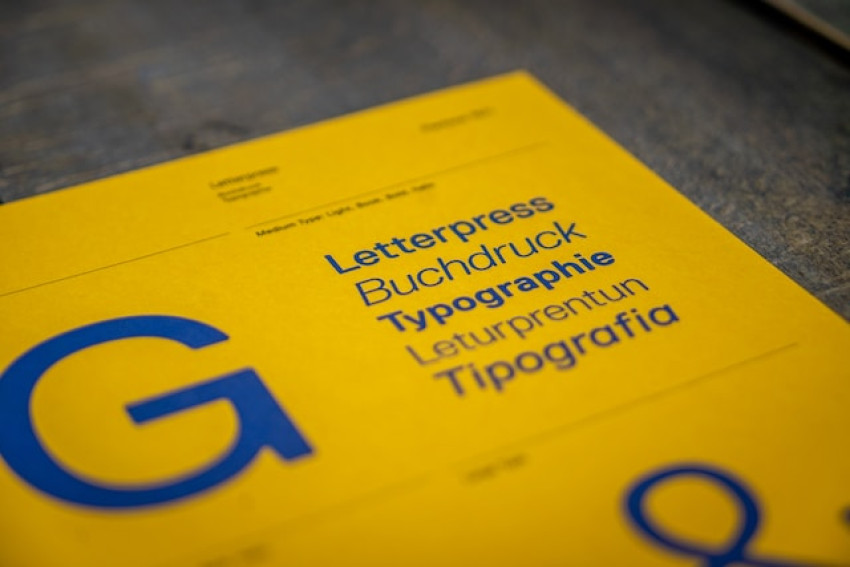
Typography is one of the essential components of graphic design that could make or break your visual text’s effectiveness. It is the technique and art of arranging type to make written text readable, legible, and compelling when displayed.
Ideal typography may help in conveying personality and emotion, creating a clear and cohesive visual hierarchy, and improving the overall user experience. Typography refers not only to selecting the perfect font but also to adopting letter, paragraph, and line spacing to enhance visual interest and readability.
In this digital age, where textual content is consumed across various platforms and devices, typography plays a significant role in design.
With the rise of the internet and social media, graphic designers have to create designs that are attention-grabbing and easily readable.
Understanding typography basics and using it effectively can help beginners create appealing designs that stand out and convey their message.
Also, using the small text art generator tools can help enhance your text’s appearance in different formats to grab audiences visually.
Things You Need to Know About Typography
Pairing fonts is one of the most essential factors of typography that can break or make a project’s design. While selecting typefaces to pair, it is crucial to consider the project’s overall style, audiences, and the message that has to be conveyed. Here are some things you need to know about typography.
Select Typefaces That Complement One Another: The successful typeface pairings are not the ones that contrast each other but the ones that complement each other. Search for typefaces with contrast styles like a sans-serif and a serif font or a light and a bold font.
Limit the Number of Typefaces: Utilizing many typefaces might be distracting and overwhelming. It is best to limit the number of typefaces to three or four per project. This will help to provide a polished and cohesive look to your text.
Pay Attention to Typeface Size: Generally, it is best to utilize a bigger typeface for the main title and a smaller typeface for the body of the text. If you want to add smaller text for the content, you can try the free small text generator tool. Using this, you can generate different and unique small texts.
Utilize Hierarchy to Guide Readers: Hierarchy is the order of the text in which it is presented to the reader. Utilizing different typeface weights and sizes can create visual hierarchies that will guide the reader.
Analyze Typeface Pairings: It is essential to analyze typeface pairings to ensure they work together. You can do this by printing out a test page and viewing it. Through this, you can get a better understanding of how typefaces look together and are perceived by the readers.
How to Choose the Right Typeface For Websites?
1) Think of Personality
The typography you choose needs to reflect your brand or product’s personality. It is because, through typefaces, you can emulate a welcoming, high-end, serious, or playful atmosphere on your website.
2) Reflect on Tone
Consider choosing a typeface that harmonizes your text’s message and tone. For instance, to convey essential messages, select a decorative or less stylized typeface that will limit distraction and be legible.
3) Do Not Skimp on the Function
Pick a typeface including style and interface while also being readable, legible, and accessible. You must keep up with function, which is as important as structure.
4) Consider Performance and Get Inspired
Use typefaces that are commonly used and rendered in a browser without issues. Utilize social media to get inspiration and discover different typefaces to add to your texts.
6) Take Some Time to Test
Take some time and test which typeface is compatible with your website content strategy. If you do so, you can discover which works best, which doesn’t, which are legible, and which feels distractive.
In Summary
By following the above article, beginners can build a strong foundation in typography and enhance the effectiveness and readability of their designs. This beginner’s guide covers almost everything from the basic things about typography to the best styles for using and combining them effectively. Make use of the ideas provided in this article to take your typography skills to the next level effectively!