
1. The Strategic Importance of Presentation Design
When you're presenting to executives, you’re fighting for their attention from the first slide. A great deck does more than just show data it keeps people from checking their phones.
If you want to keep them locked in, focus on these three things:
- The Hook: Does your design pull them in immediately? You need a clear story that connects your visuals to their goals. If they can’t see why this matters to them in the first ten seconds, you’ve already lost them.
- The 'So What?': Is your main point obvious? Don’t make them hunt for the takeaway. Complex ideas only land if you’ve stripped away the noise and organized the slide for maximum clarity.
- The Visual Proof: Are your graphics working for you? Decision-makers don't want 'filler' images. Use charts and visuals that act as a shortcut for their brain, making the data impossible to forget.
2. Leveraging Templates for Consistency and Quality
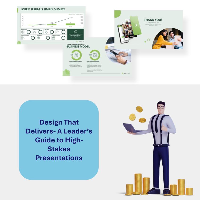
You don't need to start every deck from a blank white slide in fact, you shouldn't. Using a solid template isn’t 'cheating'; it’s just smart. A professional layout does the heavy lifting for you, making sure your work looks polished and stays on-brand without you having to stress over every pixel.
Here is how to get the most out of them:
- Pick Your Platform: Whether you’re a PowerPoint loyalist or prefer the ease of Canva or Google Slides, choose a tool that lets you move fast.
- Make it Your Own: A template is just a starting point. Swap out the generic colors and fonts for your company’s brand styles. When your deck looks consistent with your website and business cards, it builds instant trust with your audience.
- Streamline the Workflow: The goal here is to spend less time 'fiddling' with boxes and more time refining your actual message.
3. Achieving Balance Between Text and Visuals
The fastest way to lose an audience is to hit them with a 'wall of text.' If your slides are too crowded, people stop listening to you and start trying to read and they can’t do both at once.
Here’s how to keep your layout balanced and professional:
- Use Visuals That Mean Something: Don't just add a photo because the slide looks empty. Every chart or image should prove your point. If a graphic doesn't help explain the data, it's just a distraction.
- Less is Always More: You don't need to put every word you’re saying on the screen. Keep your bullet points short and punchy. If you have too much to say, put it in the speaker notes or a handout.
- Give Your Content Some Breathing Room: Don't be afraid of 'white space.' Leaving empty areas on your slide isn't a waste of space it’s how you tell the audience exactly where to look. It makes your message much easier to digest.
4. Gathering Feedback for Continuous Improvement
The best designers I know never stop tweaking their process. Getting better isn't just about learning a new tool; it’s about being open to feedback and looking at your work through someone else’s eyes.
Here is how I’m staying sharp:
- Getting a Second Pair of Eyes: I’ve started asking mentors and colleagues for 'brutally honest' feedback before I finalize a deck. It’s the fastest way to find the gaps in my logic or a slide that just isn't landing.
- Tapping Into the Community: There are some incredible design forums and LinkedIn groups where seasoned pros share their work. Getting a fresh perspective from someone outside my daily bubble helps me see new ways to solve old problems.
- Putting in the Reps: There’s no substitute for practice. I’m setting aside time every week to experiment with new layouts and run through my presentations out loud. The more I do it, the more natural the flow becomes.
It’s an ongoing process, but staying curious and asking for critiques is what keeps my work from getting stale.
Checklist for Creating Effective Presentations
Before you hit 'Save' or walk into that meeting, run through this quick gut-check to make sure your deck is ready for prime time:
- What’s the Big Point? If you can’t summarize the goal of your presentation in one sentence, your audience won’t be able to either. Know exactly what you want them to do after the last slide.
- Does the Template Match the Vibe? Don’t just pick a pretty layout. Make sure the colors and fonts back up your message. If it’s a high-stakes financial report, it should feel steady and professional, not like a creative mood board.
- Do the Visuals Work for a Living? Every chart or photo needs to earn its spot. If a graphic doesn't help prove your argument, it’s just clutter. Cut the filler and keep the 'aha!' moments.
- Give the Audience a Break: Look at your busiest slide. Is it readable from the back of the room? If there’s too much text, break it into two slides or move the extra details into a handout.
- Say it Out Loud: Don't let the first time you say these words be in front of the board. Practice your transitions, and if you can, get a colleague to tell you which parts felt clunky.
Conclusion
Mastering presentation design isn't a one-time thing it’s about constantly refining how you tell a story. When you start using smart templates, balancing your visuals, and listening to feedback, your decks stop being just 'slides' and start being a competitive advantage.
As you head into your next big meeting, keep it simple: your goal isn't just to fill a screen with data. It’s to make a connection, earn some trust, and get a decision made. Good design is exactly how you make that happen. Now, go win the room.